In October, air passenger numbers south of the border have reached 1 million per day for the first time since March, so we thought this was a good time to take a look at how the statistics have evolved in both countries since the beginning of the pandemic because we haven’t done so since early May.
Here’s a comparison of passenger numbers in Canada and the United States, including a few graphs for those who are visual.
This is about total air passengers, but soon we’ll also take a look at international arrivals to Canada specifically, because many were surprised when we said that since the beginning of the summer only, nearly 1 million entered Canada by plane and over 1 million did so overland (that excludes truck drivers).
(As we’ve mentioned many times before, the Canadian border has never been closed for us Canadians—and there are some exceptions for foreigners).
Recent Canada & United States passenger numbers
Let’s start by looking at the numbers for the last 7 days.
There was an average of:
- 791,000 daily passengers in the United States
- 22,000 daily passengers in Canada
That alone doesn’t mean much since the US has about 290 million more people than Canada.
So here’s how those numbers compare to last year’s numbers:
- 37% of last year’s numbers in the United States
- 15% of last year’s numbers in Canada
As a percentage of last year’s numbers (the data point we’ll mostly use), in the US, the recovery is over twice as high, at least at the moment.
Passenger numbers since March
Here’s a graph of the passenger numbers in each country as a percentage of last year’s numbers since the beginning of March:
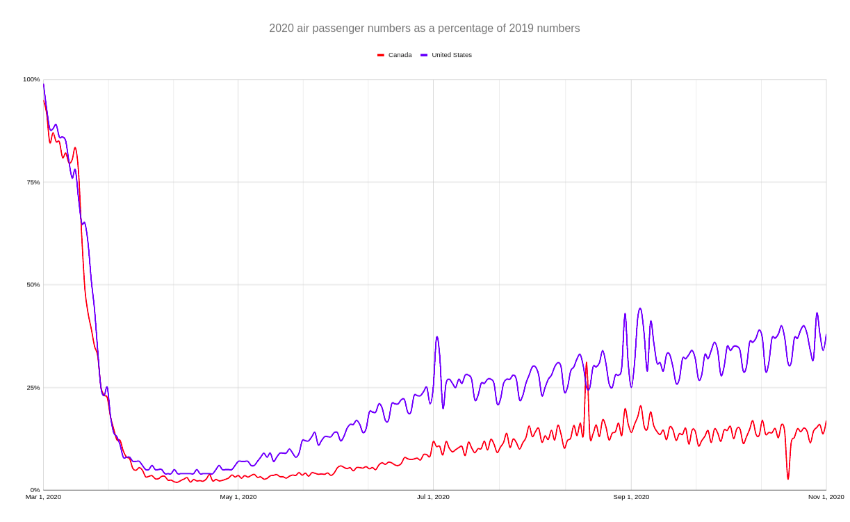
We can clearly see that the recovery is stronger in the United States since the beginning.
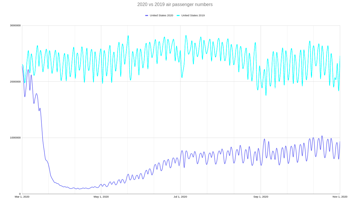
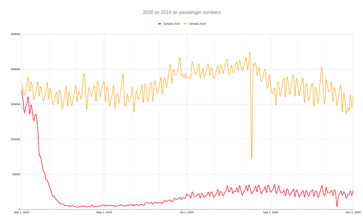
You’re probably not surprised at all by the unprecedented drop in numbers, but it’s still striking to see the actual passenger numbers on a graph, with a drop that is in the millions every single day for the US for example.
Here are the raw numbers for our Southern neighbors:
And here it is for Canada:
Evolution of passenger numbers since April
The most interesting in my opinion is to look at how the numbers have evolved since the beginning of the pandemic.
We can compare both countries by their increase since the low point of the crisis, which is in April for both.
Looking at the entire month of October compared to the entire month of April, the numbers (as a percentage of last year’s once again) have increased by:
- 653% in the United States
- 396% in Canada
Those look like big numbers because the month of April was so horribly low, so it’s better to look at it month by month.
This is the change for the monthly numbers in each country:
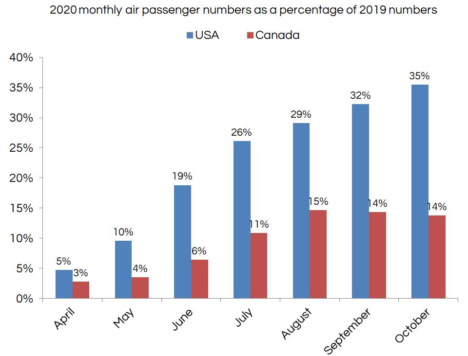
Again, the US has seen a steady increase, while Canada actually peaked in August. The US rate is now ≈ 7.5 times higher than it was in April, while in Canada it is only ≈ 5 times higher.
Records
As mentioned, the US hit the 1 million daily screened passengers milestone in October for the first time since March.
So here’s the comparison of the busiest day since March (in absolute terms) for both countries:
- 1,031,505 in the United States on October 18th
- 35,346 in Canada on September 4th
As you can see, in Canada, the pattern is quite different: we hit our peak in passengers on September 4th, which was the Friday before Labor Day, and we haven’t beaten any records since.
But again, those are just absolute numbers. What matters is how they compare to last year’s numbers (since passenger numbers vary a lot every day).
September 4th, when Canada peaked in absolute terms, happens to be the same day where the passenger numbers as a percentage of last year’s numbers were the highest in the US… but not in Canada.
Here’s the best day as a percentage of last year’s numbers since March:
- 44% of last year’s numbers in the United States on September 4th
- 31% of last year’s numbers in Canada on August 18th
I’m not sure why Canada peaked on that particular Tuesday in the middle of August, but that’s what happened (all numbers are always compared to the same day of the week the previous year to compare apples to apples).
A few details and sources
The data is provided by:
- the Transportation Security Administration (TSA) for the United States
- the Canadian Air Transport Security Authority (CATSA) for Canada
The passenger numbers actually represent the number of passengers screened at security checkpoints, which is pretty close to the actual number of fliers, as you can imagine (and it’s the best data we can get).
So, technically, the data represents the number of passengers departing from airports.
One caveat is that the TSA numbers also include all arriving international passengers connecting to another flight since the US does not allow “sterile” transits (you have to go through security if arriving internationally, except from airports with US border pre-clearance like most in Canada).
Finally, in Canada, numbers only represent the 15 largest airports in the country (for both 2020 and 2019, so the percentages are reliable). The 15 top airports represented 92% of all passenger numbers, so we could theoretically add exactly 10% of the CATSA numbers to get a figure closer to the complete data, but we chose to use the exact numbers provided by CATSA and make no assumptions.
In case you are interested, the top 15 airports are:
- Toronto–Pearson (YYZ)
- Vancouver (YVR)
- Montréal (YUL)
- Calgary (YYC)
- Edmonton (YEG)
- Ottawa (YOW)
- Winnipeg (YWG)
- Halifax (YHZ)
- Toronto–Billy Bishop (YTZ)
- Kelowna (YLW)
- Victoria (YYJ)
- Québec City (YQB)
- Saskatoon (YXE)
- St. John’s (YYT)
- Regina (YQR)
Want to get all our content about starting to travel again, whenever you are ready to do so?
Summary
In October, the US screened over 1 million passengers, hitting the biggest milestone since March. Statistics from TSA and CATSA show how passenger numbers in the US and Canada have evolved since the beginning of the pandemic, and we can see interesting comparisons between current numbers and last year’s numbers of daily passengers.
Have any questions about passenger numbers? Tell us in the comments below.
Explore awesome destinations: travel inspiration
Learn pro tricks: travel tips
Discover free travel: travel rewards
Featured image: empty airport (photo credit: Lee Sangmyeong)
Advertiser Disclosure: In the interest of transparency, Flytrippers may receive a commission on links featured in this post, at no cost to you. Thank you for using our links to support us for free, we appreciate it! You allow us to keep finding the best travel deals for free and to keep offering interesting content for free. Since we care deeply about our mission to help travelers and our reputation and credibility prevail over everything, we will NEVER recommend a product or service that we do not believe in or that we do not use ourselves, and we will never give any third-party any control whatsoever on our content. For more information on our advertiser disclosure, click here.