
Flytrippers cofounder |
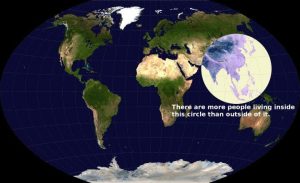
Our planet’s inhabitants are far from being evenly spread out and it’s interesting to look at this phenomenon from a different angle: how much people live on each longitude and each latitude. In other words, how many people live in each “slice” of the planet, in both directions (north-south and east-west).
Most travelers know the basics of which parts of the globe are densely populated and which parts are not, but here’s how that split looks like when looking at each slice of the globe.
Maps
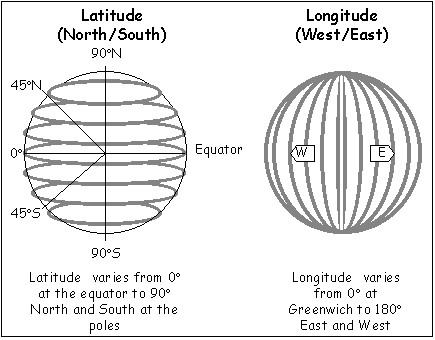
As a reminder:
- the latitude gives a north or south coordinate
- the longitude gives an east or west coordinate
So in terms of “population per 1-degree slice”:
- with the latitude, it shows how many people live in an east-west slice of the globe
- with the longitude, it shows how many people live in a north-south slice of the globe
In other words, on a 2D world map, the latitude is horizontal and the longitude is vertical. Here’s a very basic graphic that shows it clearly.
Longitude
Let’s start with the longitude.
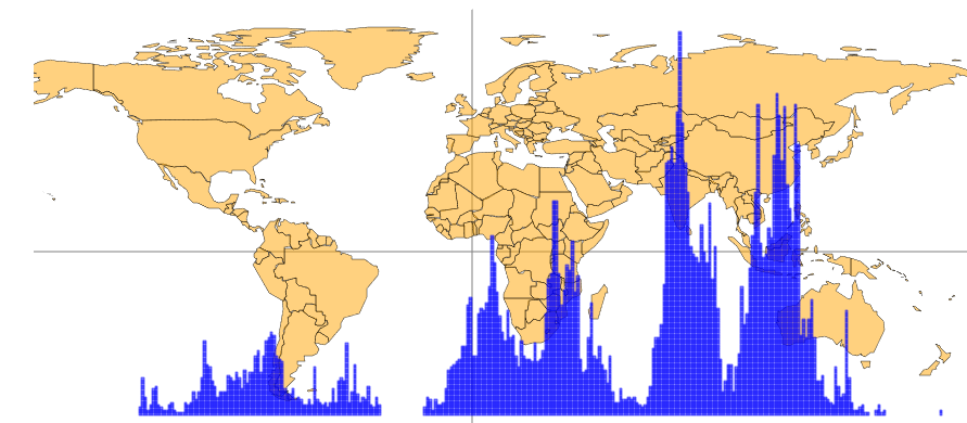
First, I’ll explain the visual. The higher the blue line at the bottom of the graph, the more people live in that vertical slice.
For example, since most of you can easily spot New Zealand (the two islands in the bottom right), you can see the easternmost blue line is pretty tiny. That’s because if you draw a vertical line at that precise spot where that last blue line is, from the South Pole all the way up to the North Pole, not many people live there. There’s basically just New Zealand, an empty part of Far Eastern Russia, and plenty of water in between.
So looking at the entire map, even if there is a lot more landmass in slices across the Americas and Europe/Africa, there are so many people living in the densest parts of Asia that they are still the most populous longitudes in the world. India is fascinating, having by far the most populous longitudes even if there is nothing but ocean south of it, and almost no one living in the regions north of it.
Without surprise, the gigantic Pacific Ocean and a portion of the Atlantic Ocean are where the lines are nonexistent.
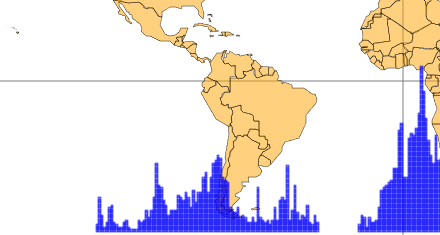
Latitude
Now let’s look at the latitude.
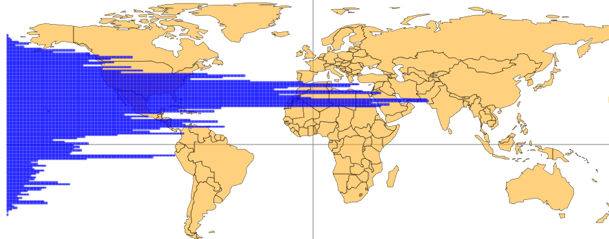
We’re not as used to considering the world in that direction. Densely-populated Western European countries actually line up with parts of North America and Asia that are virtually empty, making it once again not very high in terms of total population.
With very few exceptions, the entire Southern Hemisphere is very low-density, while the densest slices are in the Southern half of the Northern Hemisphere: the ones that line up with India and China, unsurprisingly.
If you want to see another series of interesting maps about how the world’s population is spread out, check out our post about world population density maps.
Want to get more content to discover awesome destinations?
Summary
These maps offer a way to visualize the planet’s density in a way that we’re not too used to. Unsurprisingly, they highlight the most populous parts of our world pretty clearly.
What do you think of these maps? Tell us in the comments below.
Explore awesome destinations: travel inspiration
Learn pro tricks: travel tips
Discover free travel: travel rewards
Featured image: map (photo credit: Engaging Data)
Advertiser Disclosure: In the interest of transparency, Flytrippers may receive a commission on links featured in this post, at no cost to you. Thank you for using our links to support us for free, we appreciate it! You allow us to keep finding the best travel deals for free and to keep offering interesting content for free. Since we care deeply about our mission to help travelers and our reputation and credibility prevail over everything, we will NEVER recommend a product or service that we do not believe in or that we do not use ourselves, and we will never give any third-party any control whatsoever on our content. For more information on our advertiser disclosure, click here.