
Flytrippers cofounder |
Did you know that nearly 8 billion people are living on this planet right now? That’s a lot of people, but there is a huge disparity in population density around the world—a huge disparity in how all these people are spread out. And maps always show us land, but they never show us people.
Here at Flytrippers, we love maps because as travelers, we’re extremely curious about the world we live in. And maps help us visualize the world.
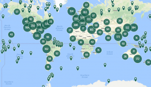
The world split into 4 equal sections based on population
Here’s a map that shows what we all know: some places are much more densely-populated (but it’s still impressive to see how much of a difference there is).
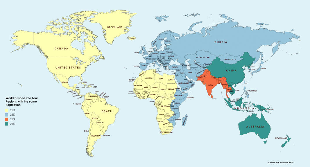
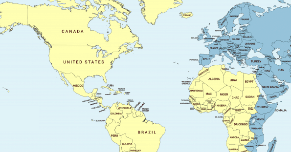
See how huge the yellow section is compared to the red section? All of America (North, South, and Central) and almost all of Africa!
When we look at a map of the world, we don’t think much about the population. Maps show us international and political borders, geological landmarks, and continental masses.
They help us get from point A to point B. And, sometimes most importantly for us travelers, maps help us find attractions, bars, restaurants, cafés, and events going on in the places we visit.
But maps don’t show people.
We think of the what and where, yet rarely the who.
Above is a map that separates our nearly 8 billion humans into four equal sections of the world (from u/OrneryThroat on Reddit). It is based on the current population.
Therefore, 25% percent of the current population actually lives in each colored section of the map—crazy, right?
And this map doesn’t even show the most extreme version of this disparity, because all 4 zones are contiguous and keep all countries in their entirety. See below for an even crazier map.
Specifically, this world map divides the population into these 4 regions:
- North, South & Central America/North, West & Central Africa = 1.9 Billion People
- Europe/East Africa/Middle East/Northern & Central Asia = 1.9 Billion People
- South Asia/Part of Southeast Asia = 1.9 Billion People
- Oceania/China/Part of Southeast Asia = 1.9 Billion People
As you can see, some areas of the planet are a lot denser than others:
- 50% of the world’s population lives just in Southern/Eastern Asia and Oceania
- 50% live in the Americas, Europe, Africa, the Middle East, and Northern Asia.
More crazy maps of the world
I always love to share the most interesting things that I find on the internet about the world and travel. Like the map above, here are some other maps I’ve shared in the past that show just how wild this planet is population-wise.
2 regions with equal population
On this map, you’ll notice two colors: blue and red. Each colored zone has the exact same population. By specifically carving out parts of countries that are especially dense (or not dense), it’s an even more striking difference in population.
We posted an article about this before, but we wanted to share it again because it is related to today’s map about how unevenly-spreaded we are.

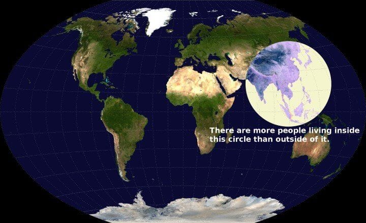
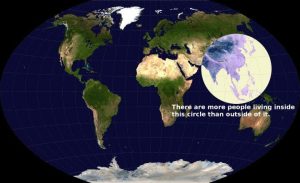
More people live within this circle than out of it
Back to comparing the entire population on Earth, this one we also shared previously compares only 2 equal ones instead of the 4 equal ones in today’s new map above.
It does it in another way though, by contrasting inside the circle vs outside. More people live there than in the rest of the world combined.
The world’s population divided into 10 equal sections
As we showed you in a previous article, this map below shows how dense human populations can be in certain parts of the world by dividing up the Earth as 10 “slices” of varying widths.

As you can see, the densest areas are in Asia and the Middle East and they are much much denser than America.
Country populations separated into 4 sections
Back to 4 sections instead of 10, but at the country level. Here are maps of Canada, the US, California, Australia and Chile with their respective populations split into 4 equally populous sections.
Canada

The United States of America

State of California

Australia

Learning how to travel for less
Join over 100,000 savvy Canadian travelers who already receive Flytrippers’ free newsletter so we can help you travel for less (and inspire you, too)!
Summary
Clearly, our world is enormous, and the amount of humans on it seems somehow even bigger. But, creative maps like this are an entertaining way to see how we are all spread over this big beautiful planet. Perhaps next time you are out-and-about in a new country, you’ll think back to these maps and see how the population is reflected in reality.
Don’t forget to check out our cheap flight deals page to get you to your next destination on a budget! And please, share this article with your map-loving friends, and maybe they could also learn a thing a two!
What would you like to know about these maps? Tell us in the comments below.
See the flight deals we spot: Cheap flights
Discover free travel with rewards: Travel rewards
Explore awesome destinations: Travel inspiration
Learn pro tricks: Travel tips
Featured image: Population Density (image credit: Kelsey Knight)