Flytrippers cofounder |
We all know that some places are a lot more populated than others. But this map helps you see visually, in a very clear way, that the world’s population isn’t evenly distributed at all!
I don’t know if it has anything to do with the fact that we love traveling, but we love maps. All kinds of maps. They help visualize and understand the world we live in.
So besides the crazy cheap flights on our deals page and all our inspiration and tips articles, we often share cool maps that you could find interesting.
We will also be relaunching our online store just in time for BLACK FRIDAY next week, with plenty of essential items for travelers, at the best price! There will be items for those who love maps, of course! We can’t wait to show you, subscribe to our free newsletter if you don’t want to miss any of this: if you love to travel, you’ll love it!
So let’s look at this map of the world’s population.
Population density maps
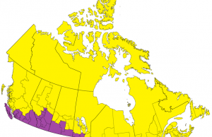
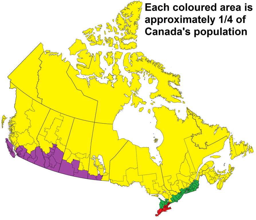
We already shared this map of Canada divided into 4 evenly-populated sections and it was very popular (the same map is also available for the United States, California, Australia and Chile in the post).
So I wanted to share this map with you, which is pretty much the same thing, but for the entire world.
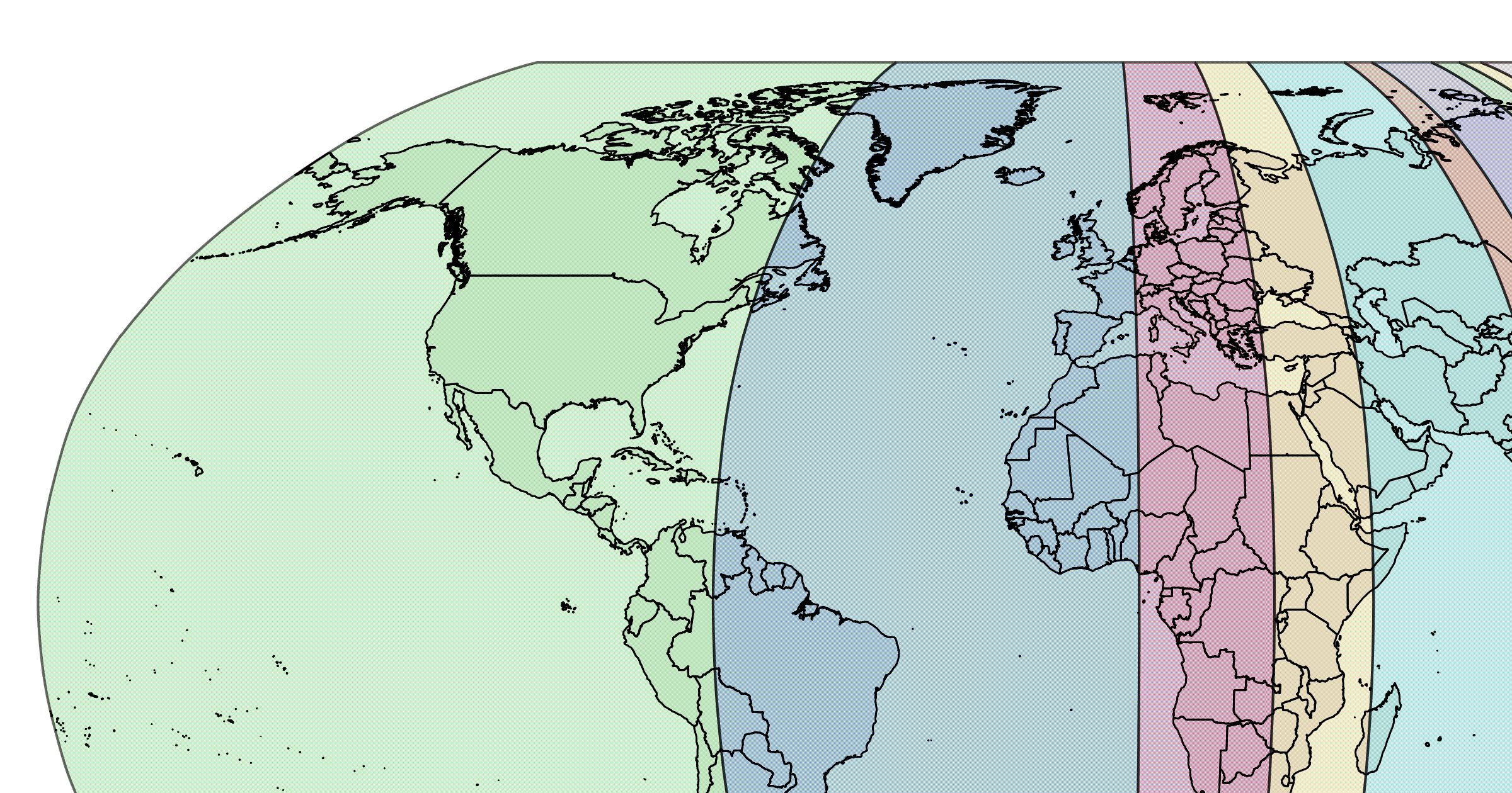
And instead of being divided into 4 equal sections, the total world population is rather divided into 10 equal sections.
Here it is:
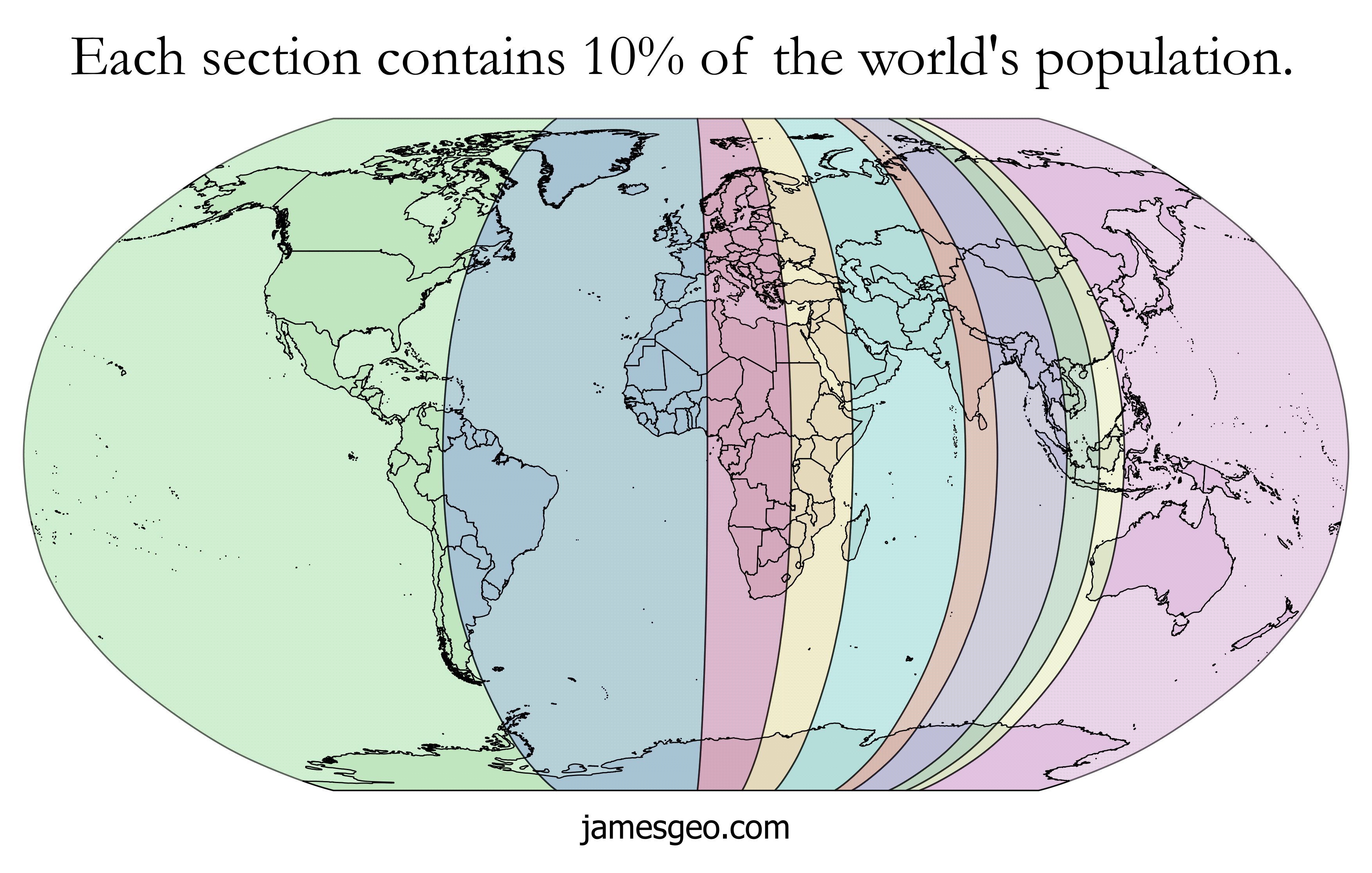
Well, what is clear is that we here in the green part live in the largest section (by far), and therefore the least densely populated (unless you’re reading this from Atlantic Canada?… where I happen to be right now writing this).
Surprisingly, the purple section at the other end (actually the one immediately to our left I should say) that contains Japan (and the most populous city in the world) is also quite big. The one that has France, England, the Iberian Peninsula and a piece of Africa is big too, but there is a whole ocean in there too.
But it’s when you compare those to the 3 slimmest sections that the difference is the most striking. The orange section that contains the center of India, the green that contains a good chunk of Southeast Asia and finally the yellow that contains China’s east coast… they’re really very small areas.
Especially that in all 3 cases, almost all of the bottom half is water … and the top quarter (almost a third) is mostly uninhabited. That’s a lot of people in the little area that remains!
And yet, each of these thin sections contains as many people as nearly all of North America and South America combined (excluding roughly our Atlantic provinces, Brazil and a part of Argentina).
So as much as the maps of the world distort our perception by giving us an impression that our country is much larger than it really is in terms of area, we must also remember that those maps show just that, the area… and that humans are far from being equally distributed!
This is an impressive map that shows how there’s not a lot of us on this side of the world! What do you think?
Want to see our current discounted plane tickets?
Click here to see our flight deals
Want more travel tips and inspiration?
Click here to see the blog homepage
You’ll probably enjoy this article:
How To Find Cheap Accommodations When Traveling
Help us spread the word about our flight deals and travel tips by sharing this article and most importantly bookmark Flytrippers so we can help you navigate the world of low-cost travel!
Advertiser Disclosure: Flytrippers receives a commission on links featured in this blog post. We appreciate if you use them, especially given it never costs you anything more to do so, and we thank you for supporting the site and making it possible for us to keep finding the best travel deals and content for you. In the interest of transparency, know that we will NEVER recommend a product or service we do not believe in or that we do not use ourselves, as our reputation and credibility is worth far more than any commission. This principle is an essential and non-negotiable part of all our partnerships: we will never give any third party any control whatsoever on our content. For more information on our advertiser disclosure, click here.