Throughout your life, you might have thought that world maps accurately portrayed every country’s size, but that’s REALLY not the case. Prepare to be quite shocked because almost every time I’ve shown this to anyone in the past few years, they’re surprised. Canada is really not as big as it seems — it’s big of course, but not as big as Africa (as it seems on maps).
Personally, I love maps, geography, and everything related to them. One of the reasons I love using my 100+ pro tips to travel for less is to be able to fill in my personal map of places to visit (which includes every country in the world) and learn more about our planet.
Here’s something you should definitely know about the true size of countries.
The true size of Canada
See how big Canada seems on a “normal” map.
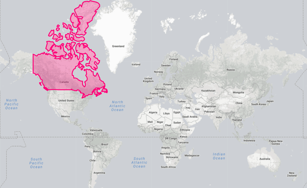
Looks almost as big as Africa, doesn’t it?
Africa is actually more than 3 times bigger than Canada.
This is Canada’s true size.
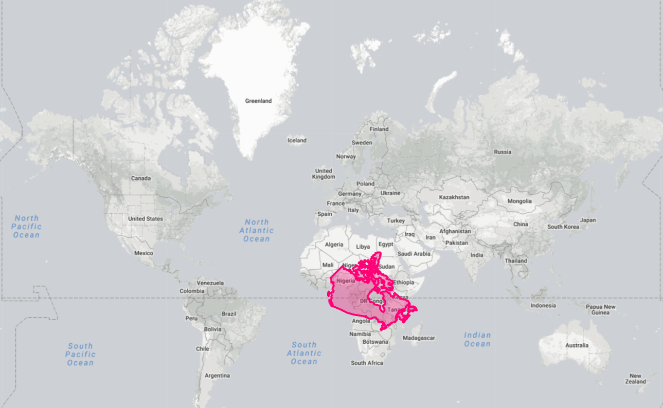
That’s quite the difference, eh? Yes, maps have been lying to you forever!
I found this fascinating when I discovered this when I was younger — I’ve always loved geography — and wanted to share it with travelers like you, too.
Why maps don’t show the true size of countries
It’s pretty simple when you think about it.
Obviously, our planet isn’t flat. So, picturing all the different countries on our 2-dimensional flat map disproportionately portrays the size of every country. Very much so!
The “true” size shown above is in fact the size when brought back to the correct scale at the level of the equator.
For example, if I do the opposite and show you Brazil’s true size relative to compare it to the size of Canada on maps, you can also see how the South American giant is also very different than what it looks like on maps.
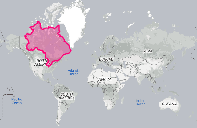
The most widely used map, called the Mercator projection, represents country sizes very inaccurately, especially those farther from the equator. The farther a country is from the equator, the more world maps distort its “true” size and exaggerate it.
So yes, Canada is pretty big… but in reality, it’s not as big as it seems. We have a big chunk that’s very far from the equator, so very distorted by maps.
Brazil is actually the biggest contiguous land area in the Americas (Canada is larger overall thanks to our many islands). In fact, even the United States has more land area than we do in Canada (Canada is just bigger overall thanks to our water area).
How to see the true size of countries
If you want to play around with it a bit and see the true size of every country, you can use the interactive map on the website The True Size, which was created to educate people on this cartography quirk.
Type in the name of any country and then move it around to see its true size relative to what you want to compare it with. It’s pretty interesting!
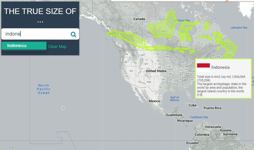
For example, you can see that Indonesia stretches from one ocean to the other when it’s over Canada (you can read our overview of 14 destinations in Indonesia, one of the 30 best countries to travel to for $40 total per day).
You can also rotate countries by using the compass icon in the bottom left corner.
It really makes you realize how much bigger the countries near the equator are, especially the African continent (you can read our overview of the 5 different regions of Africa).
A better map that shows the true size of countries
If you want a map that is much better to accurately represent countries and their true sizes in 2D format, here is the Gall-Peters Projection.
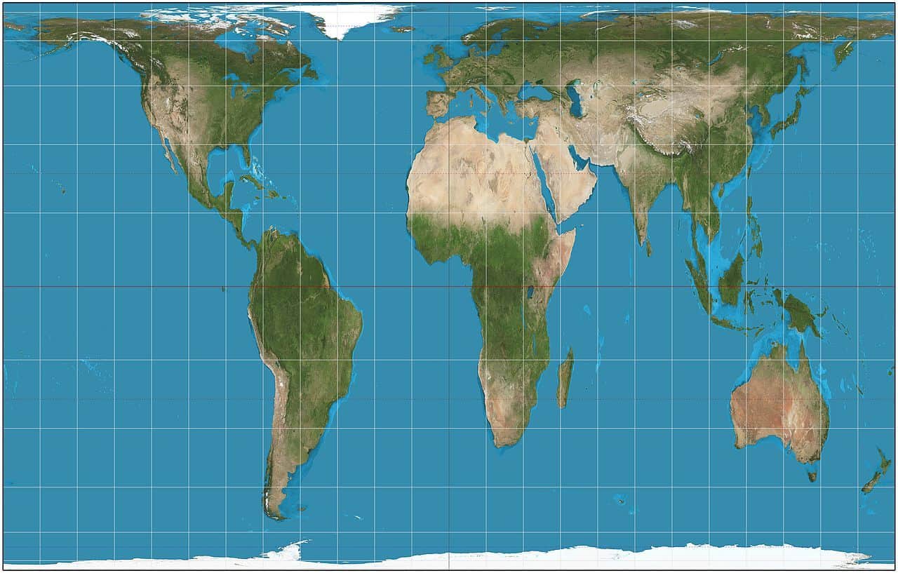
Those are the true relative sizes of every country.
This projection keeps the sizes accurate… but it distorts the shapes. The Earth’s curves sure mean there can never be a perfect map projection!
Here’s another map that shows the true sizes (in darker blue) superimposed over the “normal” map by a Reddit user named neilrkaye.
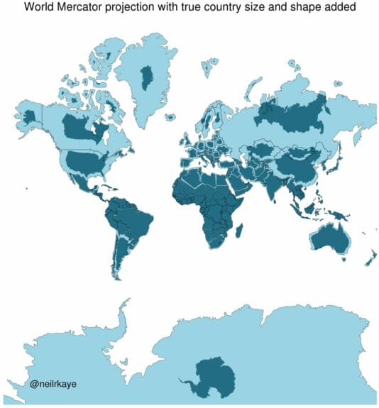
He also made an animated version.
Learning how to travel for less
Join over 100,000 savvy Canadian travelers who already receive Flytrippers’ free newsletter so we can help you travel for less!
What would you like to know about the true size of Canada? Tell us in the comments below.
See the flight deals we spot: Cheap flights
Discover free travel with rewards: Travel rewards
Explore awesome destinations: Travel inspiration
Learn pro tricks: Travel tips
Featured image: True size of Canada (image credit: The True Size)

