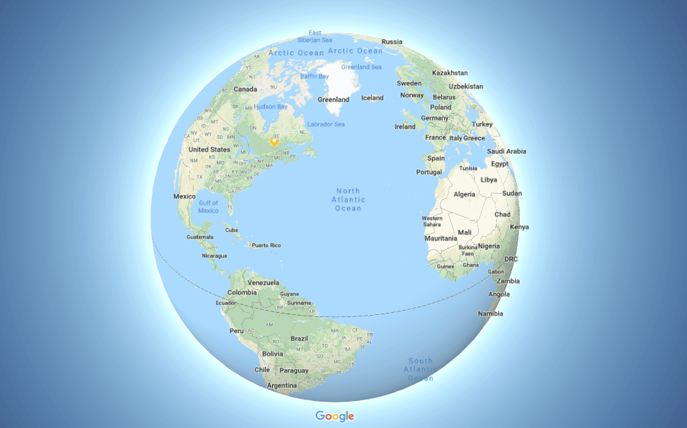
Unless you’ve been living under a rock, by now you know that the Earth is round and flat-earthers are just plain wrong. Now Google Maps has finally changed to show this.
If you see an amazing deal to an obscure city on our flight deals page and are wondering where that is, you might open up Google Maps. That’s what I do whenever I read anything about a city I don’t know well, I love to see where it is visually on a map.
Anyway, I know not every one is a geography geek and map enthusiast like I am, but I’m pretty sure everyone uses Google Maps… it’s probably the most popular map tool globally.
And knowing how popular our previous map posts were, you will probably find this news interesting.
The Earth Is Now Round On Google Maps
Even though (almost) everyone knows very well that our planet is round, some were still very surprised when we shared that all maps were fooling you into thinking Canada is much bigger than it actually is.
READ ALSO: You’ve Been Fooled By Canada’s Size Your Entire Life
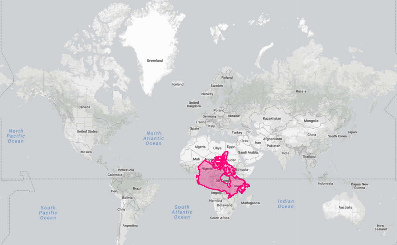
As a reminder, here is how Canada really compares to Africa for example, when you take into account the fact that flat maps grossly exaggerate the parts further away from the Equator.
We’ll have a couple of follow-ups to that article too. If you haven’t already, be sure to subscribe to our free newsletter like 35,000 Canadians already have to get all our great content, including flight deals for 50% less than the “normal” price.
Yes, most maps still misrepresent every country’s size, but now at least Google Maps no longer does (they used to use a standard flat Mercator map to increase the accuracy of mapping out roads and streets).
You might have noticed that for the past few weeks, the desktop version of the software now uses a round planet instead of a flat one.
So when you zoom out, you can now see that the view kind of spins out a bit, and you can notice the angle: the map is oriented slightly differently than it usually is with a regular flat map.
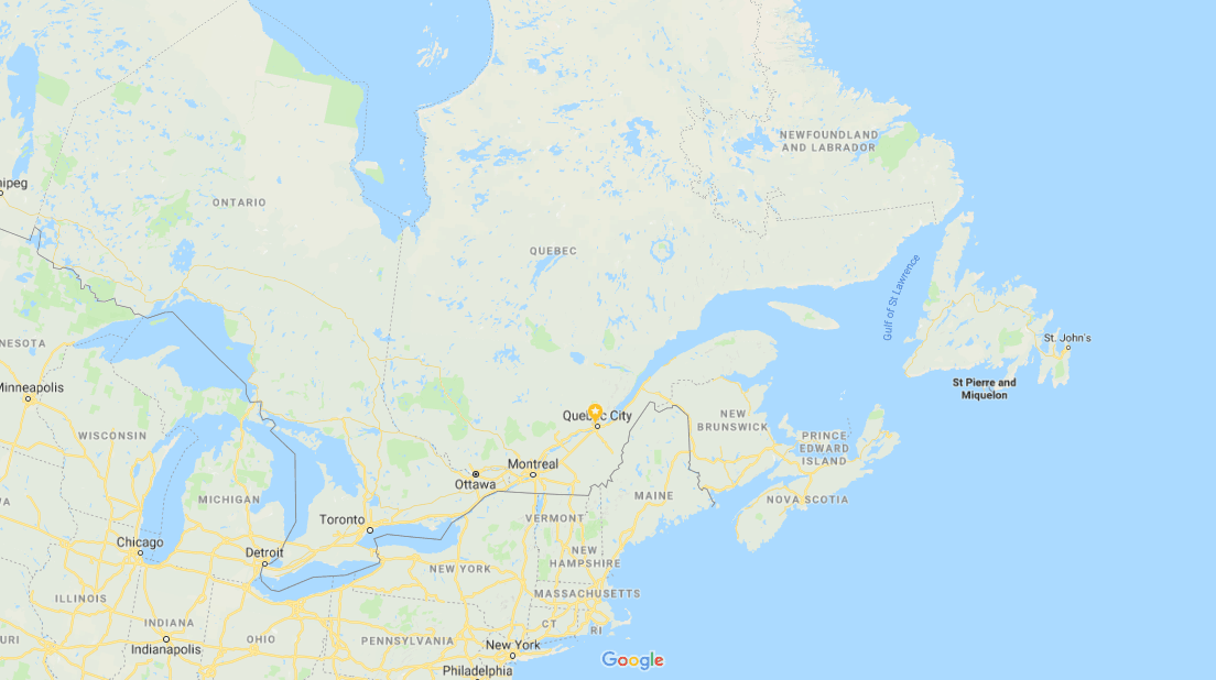
It’s not that huge of a change or anything, but it’s a great way to help you visualize the world in a way that is slightly more accurate.
Instead of Greenland seeming to be of a comparable size to Africa, it’s now a bit easier to see that Africa is actually 14 times larger.
Sometimes, a video is worth a thousand words. So check out this tweet by Google that explains the 3D Globe Mode.
With 3D Globe Mode on Google Maps desktop, Greenland’s projection is no longer the size of Africa.
Just zoom all the way out at https://t.co/mIZTya01K3 ?? pic.twitter.com/CIkkS7It8d
— Google Maps (@googlemaps) 2 August 2018
Bottom Line
Google Maps now better represents every country’s size and takes into account that the Earth is round.
What do you think about this change?
Want to see our current discounted plane tickets?
Click here to see our flight deals
Want more travel tips and inspiration?
Click here to see the blog homepage
You’ll probably enjoy this article:
How Ultra Low-Cost Carriers Work
Help us spread the word about our flight deals and travel tips by sharing this article and most importantly bookmark Flytrippers so we can help you navigate the world of low-cost travel!
Advertiser Disclosure: Flytrippers receives a commission on links featured in this blog post. We appreciate if you use them, especially given it never costs you anything more to do so, and we thank you for supporting the site and making it possible for us to keep finding the best travel deals and content for you. In the interest of transparency, know that we will NEVER recommend a product or service we do not believe in or that we do not use ourselves, as our reputation and credibility is worth far more than any commission. This principle is an essential and non-negotiable part of all our partnerships: we will never give any third party any control whatsoever on our content. For more information on our advertiser disclosure, click here.

