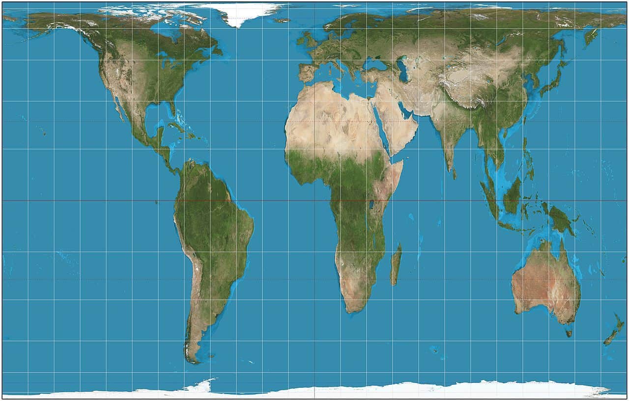
Our 2-dimensional world maps are misleading, and they enormously exaggerate the size of many territories. That includes Canada and Greenland, which look the same size as the entire African continent. Yet Greenland is 14 times smaller than Africa (Canada is 3 times smaller than Africa). Yes, maps do not show you the true sizes!
We already told you about the extreme mapping distortion years ago. But since Greenland is in the news more than it has ever been, it’s a great time to remind you. Being a traveler should also be about loving to learn about our world!
Personally, I love geography, and anything to do with it, so this topic is a bit different from Flytrippers’ 3 types of content that help you travel for less, namely flight deals, travel rewards, and tips/inspiration/news.
Here’s what you need to know about the true size of Greenland and Canada.
The Mercator projection
The Earth is round. And representing that on a 2-dimensional map is not easy.
Our well-known world map uses the Mercator projection… and that completely distorts the real size of the countries.
It is highly disproportionate. Especially the countries far from the planet’s center. They are not as huge as you might think.
Everything far from the equator looks much bigger than it really is. The farther a country is from the equator, the more 2-dimensional maps “exaggerate” its true size.
Including Canada, which is much smaller than it looks. Don’t be mad; it’s still huge, of course. But just not as huge as maps make it seem. It’s certainly not even close to being the size of the entire African continent.
Yes, maps have been lying to you all along!
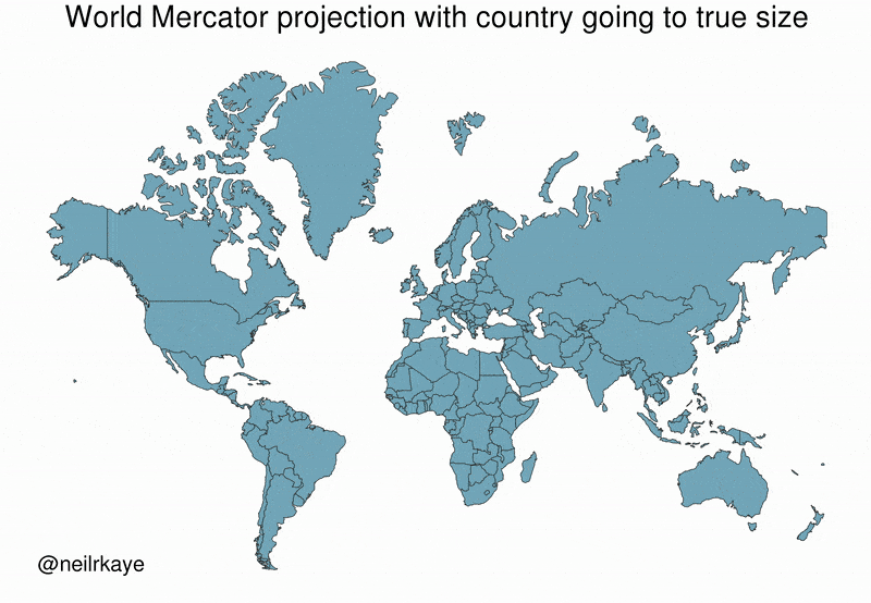
The Peters projection
The Peters projection is one that is more faithful to reality, but unfortunately, there doesn’t seem to be much appetite for using it.
It allows you to see the real size of all countries. This is the map we should obviously be using (but people are terrible at accepting change in general).
On this map, it is much clearer that Africa is 14 times the size of Greenland.
It also shows that Canada, which is of course still very big, is still quite a bit smaller than what the “normal” maps project.
It better illustrates that Brazil has the largest contiguous territory in all of the Americas, and that the US actually has more land area (excluding water) than Canada… 2 very little-known facts.
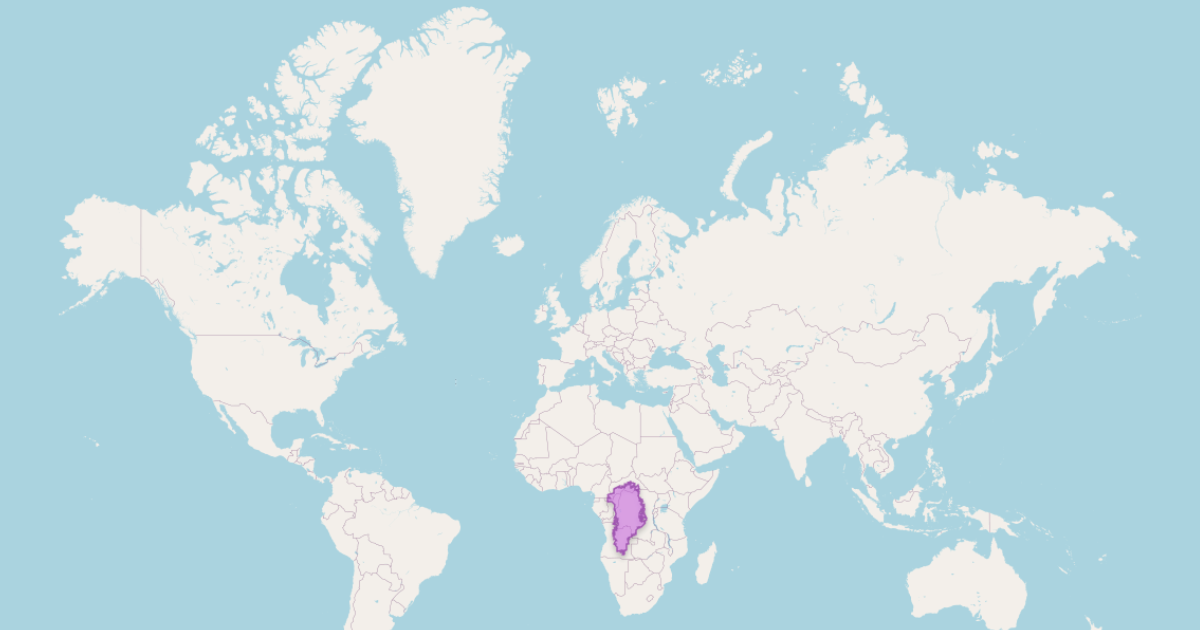
The real size of Greenland
Greenland is an excellent example of this mapping distortion.
Here is the real size of Greenland (in blue) when the (currently) Danish territory is scaled back to the size that would be displayed if it were on the equator.
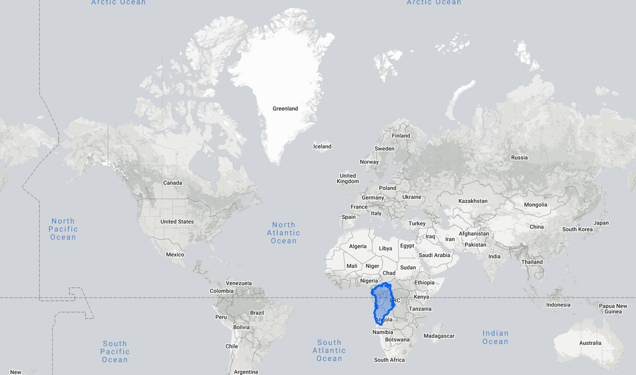
In short, it’s a lot smaller than it looks on our maps, isn’t it?
And Africa, like all the areas near the equator, is much bigger than it looks. The Democratic Republic of the Congo (DRC on that map) alone is actually bigger than Greenland.
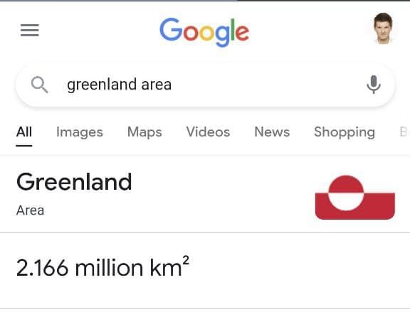
Greenland is 2.166 million square kilometers.
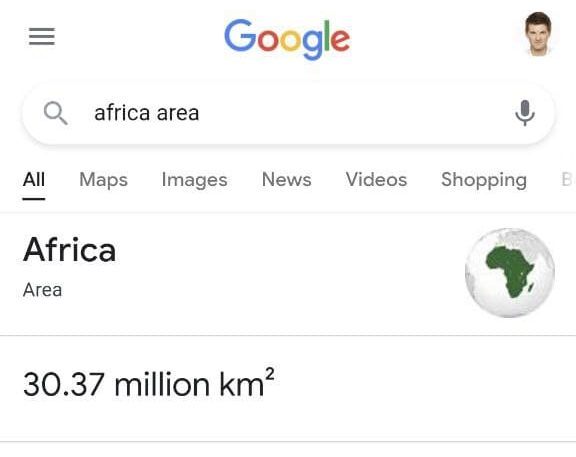
While Africa is 30.37 million.
(Which is 14 times bigger!)
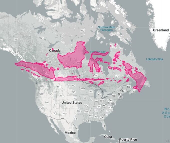
The real size of Canada
See how big Canada looks.
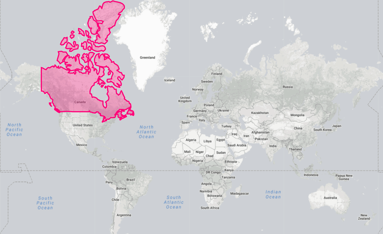
It looks the same size as the entire African continent!
And then look at the same map, but with the “real” size of Canada.
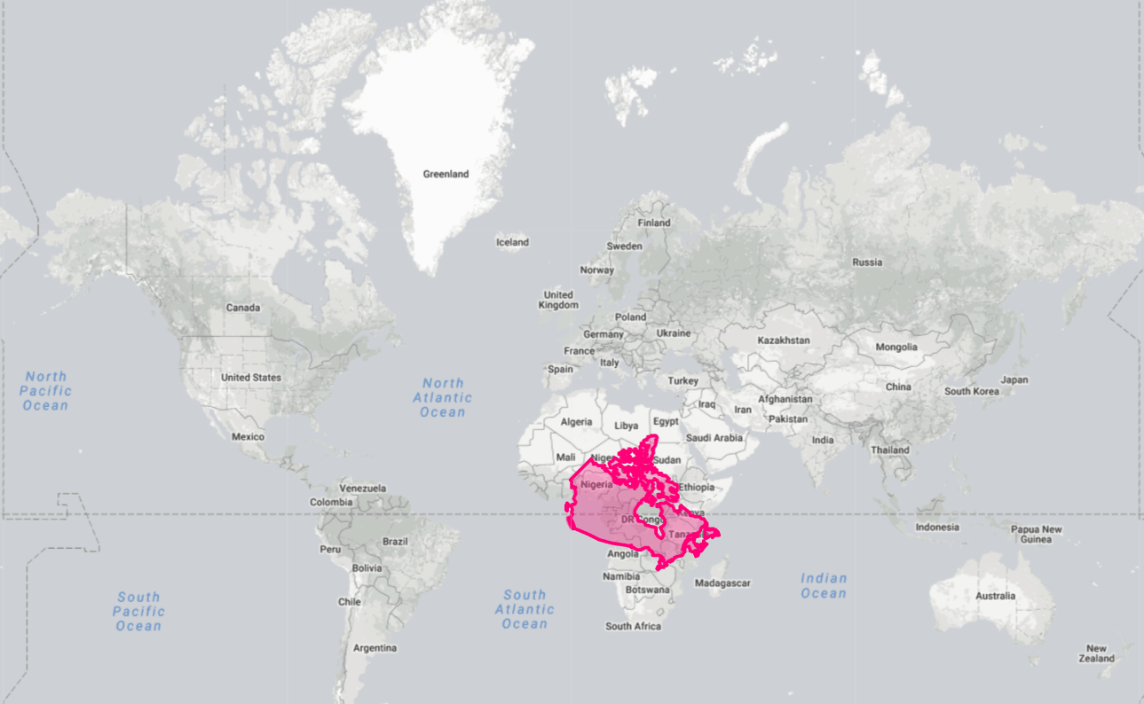
Still huge, but 3 times smaller than Africa!
This also shows that Africa is really huge…
Animation to visualize the optical illusion
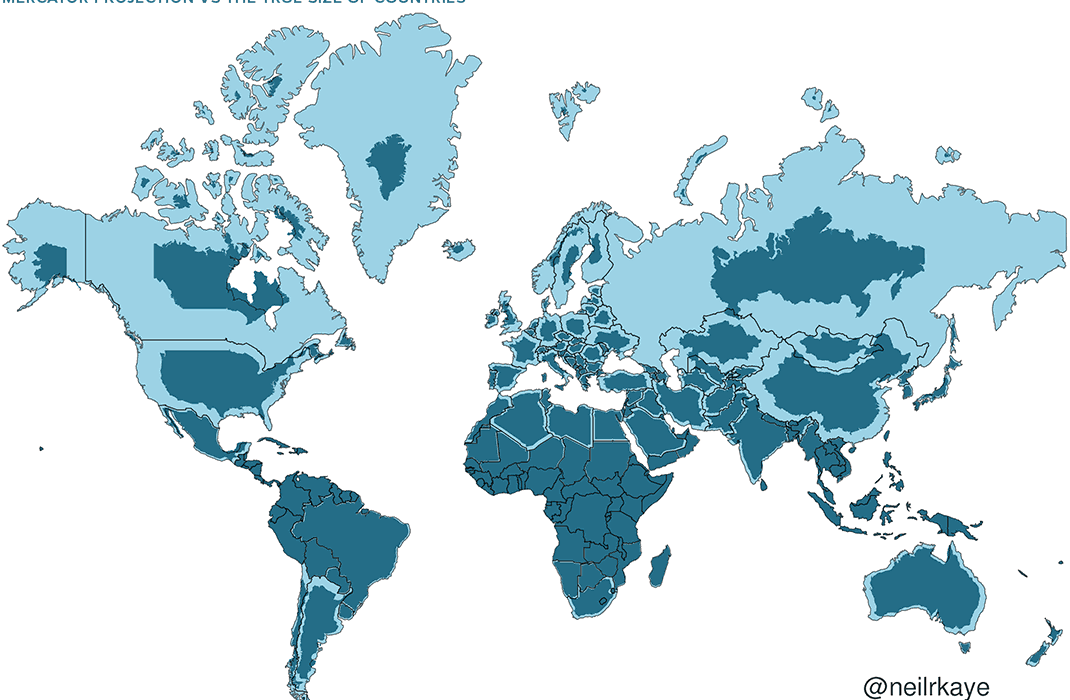
Someone developed this little animated GIF that shows you quickly and clearly that traditional maps are very misleading.
Here is the real size of all the countries.
Quite striking to see how Canada shrinks in an animation like this (Greenland is pretty crazy too).
You can also see the comparison easily with this image of the two projections superimposed.
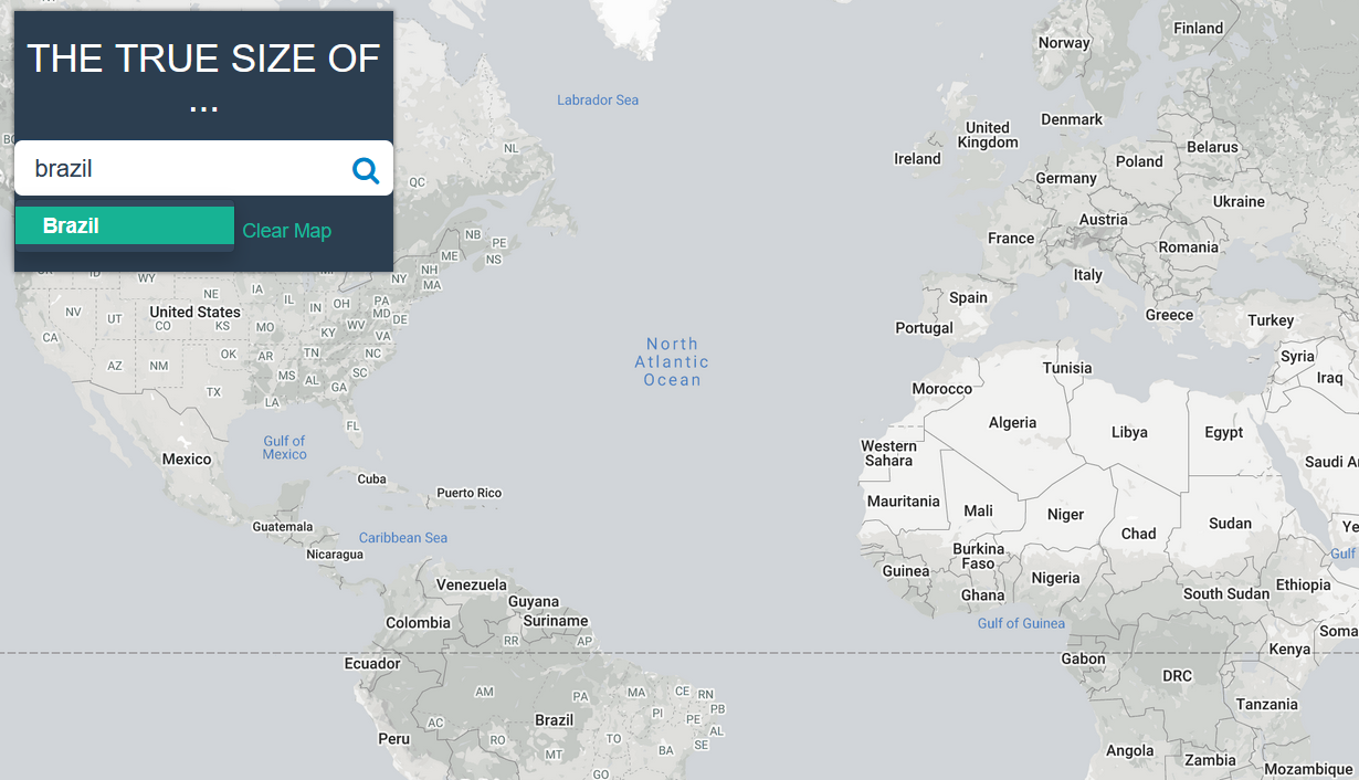
The True Size tool
If you want to play around with this a bit and find out how big each country really is (as I said, the further away a country is from the equator, the bigger it looks on a map), you can use the interactive map on The True Size, a site that was created to educate people about this reality of cartography!
You write the name of the country on the left, and then you can move it around to see the size adjust to the true relative size it represents. It’s pretty interesting!
It especially makes you notice how much bigger the countries near the equator are than you might think.
We’ve talked about the African continent quite a bit. It’s really huge, much more than most people realize, and it’s fascinating to see how many places there are to explore in this enormous territory, with 54 countries in 5 pretty different African regions.
But it’s not very popular with most travelers, the less-experienced travelers. It’s clearly a place that isn’t for beginners, but even somewhat experienced travelers have never set foot there. Maybe that will change with the new (and first) route from Canada to Sub-Saharan Africa.
So, for our example of how to use The True Size tool, I’ll go somewhere else. On the continent that’s the very best for travelers.
Let’s look at Indonesia, which is by far one of the most affordable countries to travel to. It’s wild to see how the archipelago’s size compares to Canada’s, from West to East!
That means there are many affordable (and beautiful, and exotic) places to explore. You can spend almost 1 full month there for free, just with the amazing $825 welcome bonus on one of the best cards for travel rewards beginners!
Learning how to travel for less
Join over 100,000 savvy Canadian travelers who already receive Flytrippers’ free newsletter so we can help you travel for less (and inspire you, too)!
Sign up for our free newsletter
Sign up for our newsletter
Summary
The real size of Greenland is much smaller than you probably thought.
What would you like to know about this destination? Tell us in the comments below.
See the flight deals we spot: Cheap flights
Discover free travel with rewards: Travel rewards
Explore awesome destinations: Travel inspiration
Learn pro tricks: Travel tips
Featured image: Greenland’s fake size (image credit: TrueSize.net)